Nonprofit Brand Launch
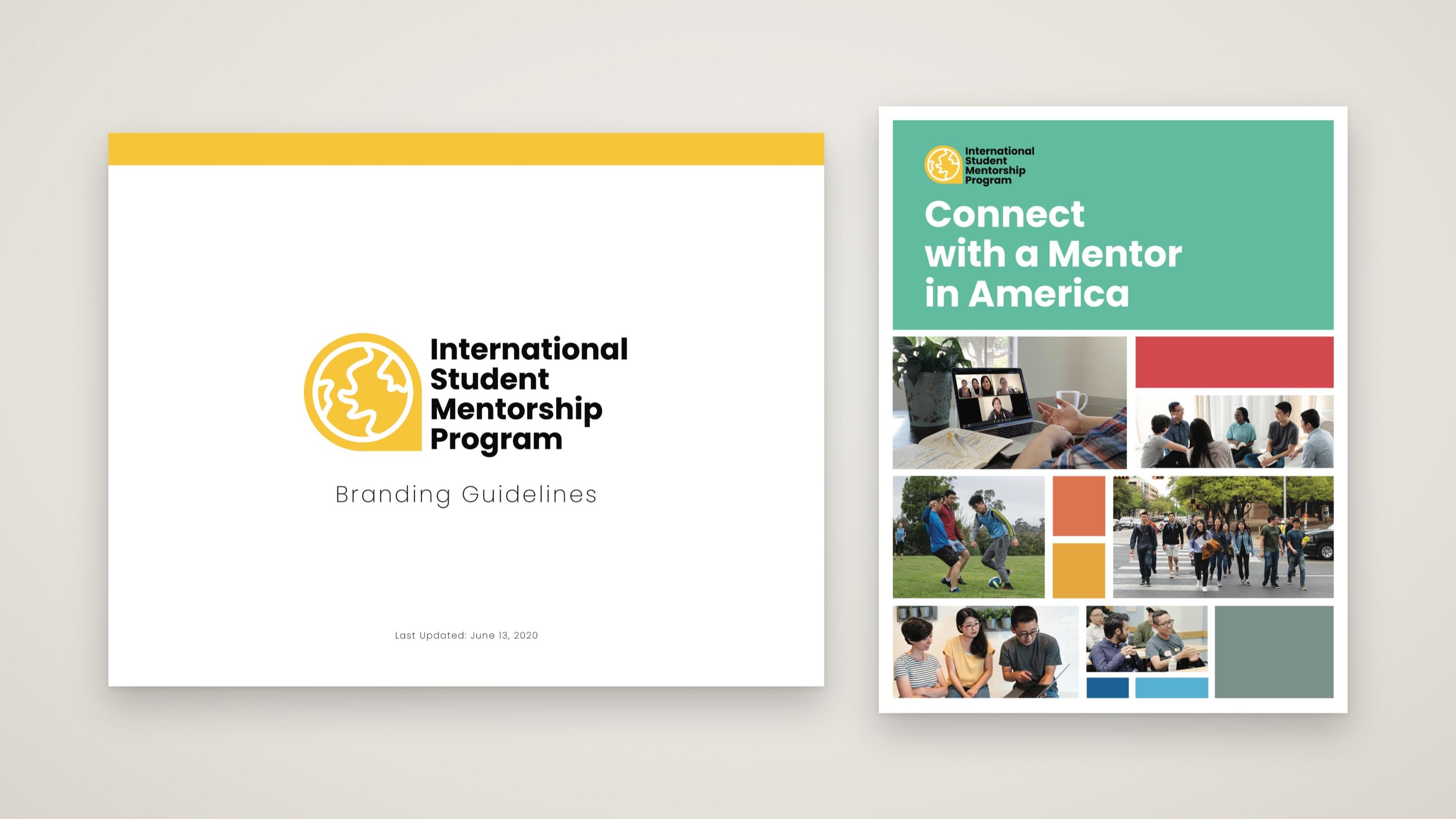
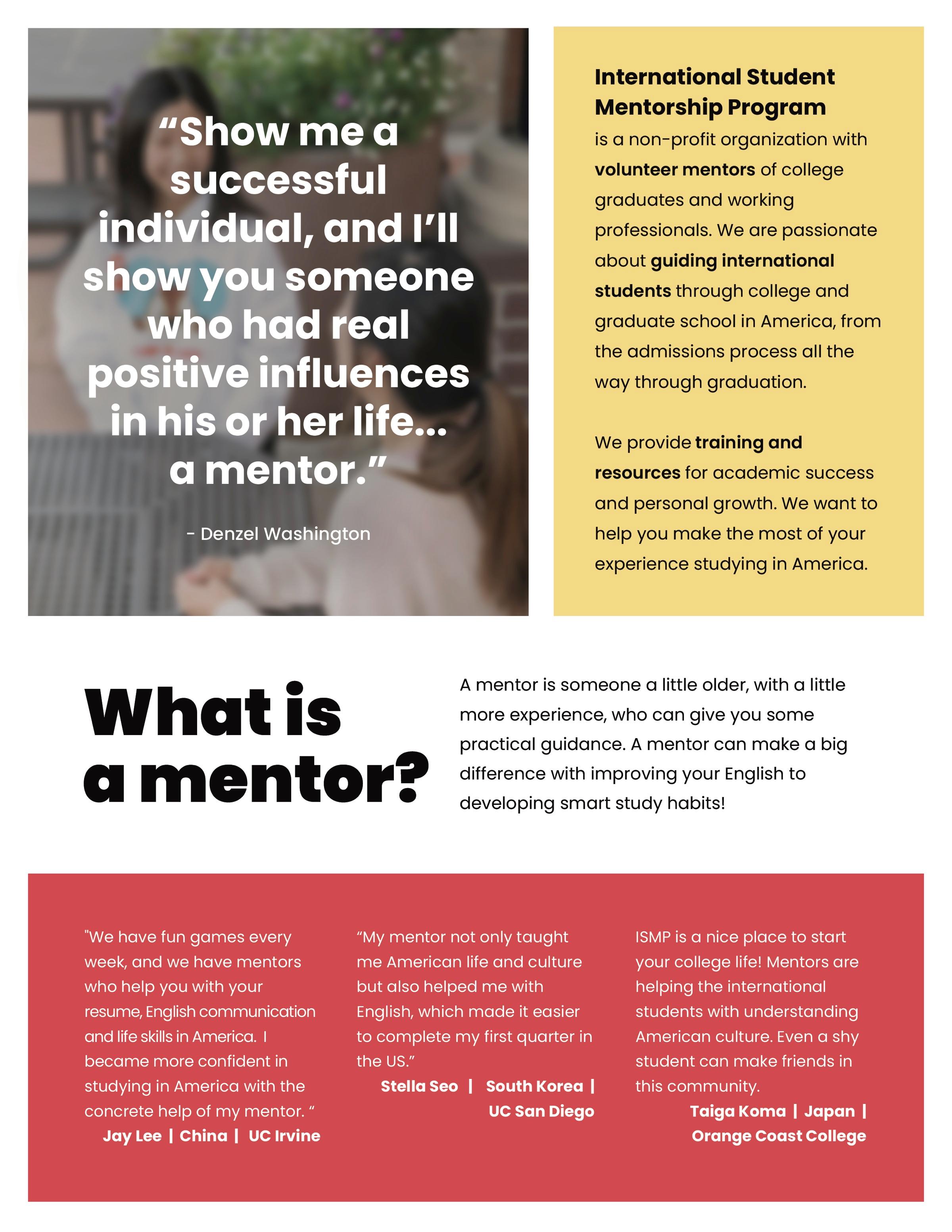
A brand built from a blank page for a new international student mentorship nonprofit. I created the logo and identity, then led the visual direction for a five-person team of photographers, a designer, a web developer and a content creator.
- Client
- International Student Mentorship Program
- Industry
- Nonprofit · Education & mentorship
- My role
- Brand Director
- Scope
- Naming, with the founding team, Logo & visual identity, Brand guidelines, Creative direction, Print design, Canva brand kit
The challenge
A brand-new nonprofit with nothing visual to start from and no design team to build it.
The International Student Mentorship Program connects international college students with professional mentors who help them adjust to life in America. In 2020, a team of our staff dared to imagine how we could start a new mentorship program in the midst of Covid shut-downs. There was no group yet; there was no logo, no colors and no guidelines. We started from scratch.
We also didn't have the resources for a full brand team. On a small founding staff, everyone wore many hats, and brand was one of mine alongside managing work across the organization. Most of the team weren't designers, and the one designer was still early in their career, so I coached them as we went.
Creative approach
Professional, but clearly a group of people who genuinely care.
It started with the name. As a founding group, we chose one that tells people exactly who we are over a "prettier" name that would need explaining.
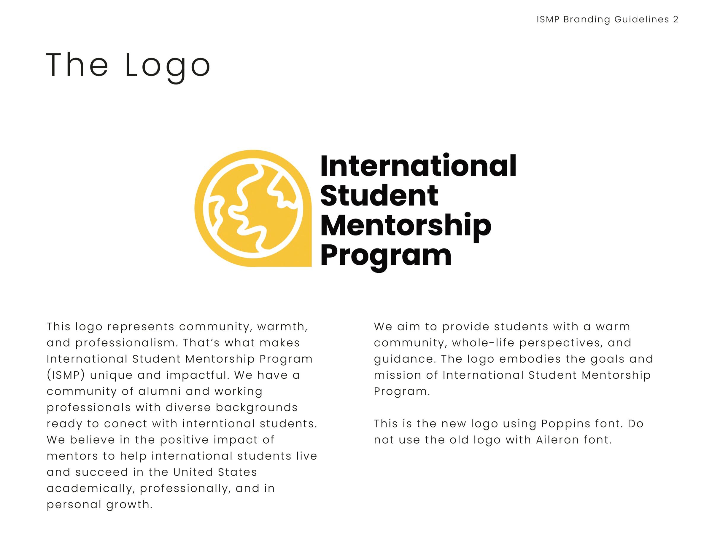
For the logo, I chose a globe that isn't centered on the US, to show we're a globally-minded and set it inside a map pin, rotated on it's side. Bright yellow makes it stand out, paired with bold Poppins type.
This was 2020, during Covid shutdowns, and most of us had full-time jobs. There was little time to iterate, so the focus was on getting a solid foundation off the ground and writing guidelines others could follow.
Say who we are
A name and logo that explain themselves, with nothing to decode.
Global, not US-centric
A globe and a map pin for students arriving from all over the world.
Professional and warm
Credible to students and partners, and clearly run by people who care.
My role
I designed the brand myself and led the visual direction for a five-person team that applied it across the program.
- Naming, with the founding team
- Logo and visual identity
- Brand guidelines
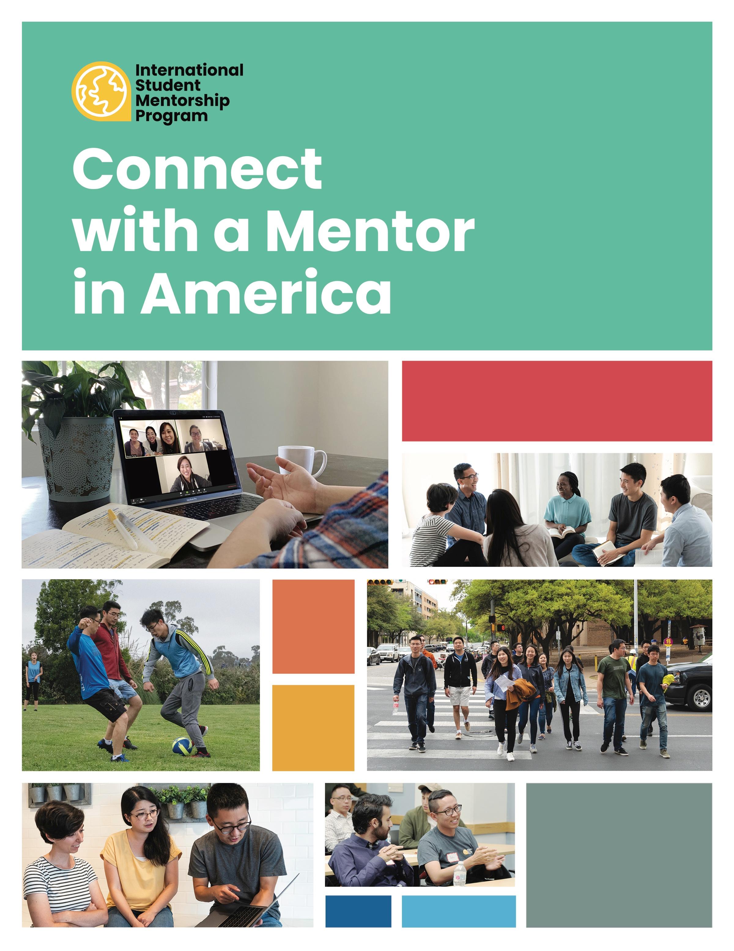
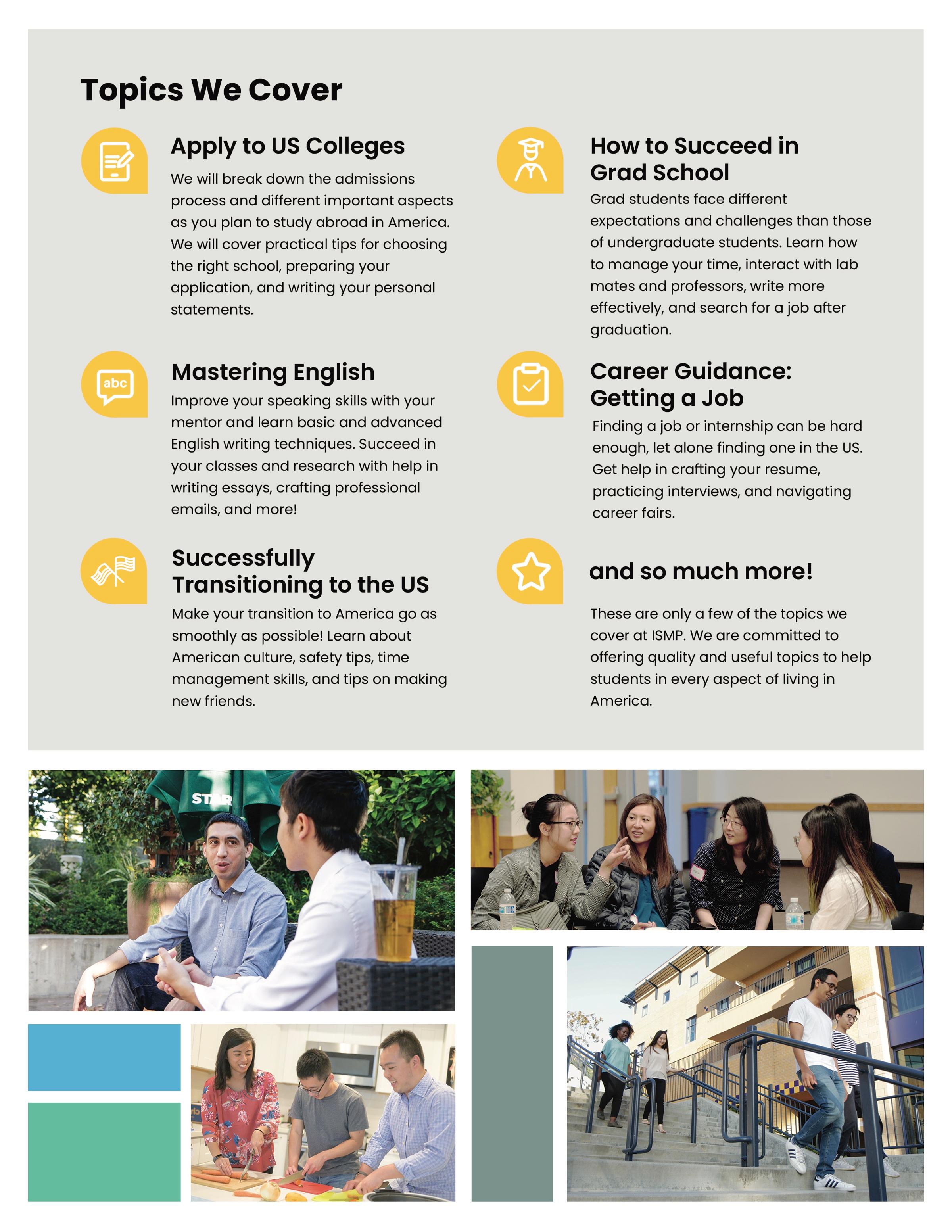
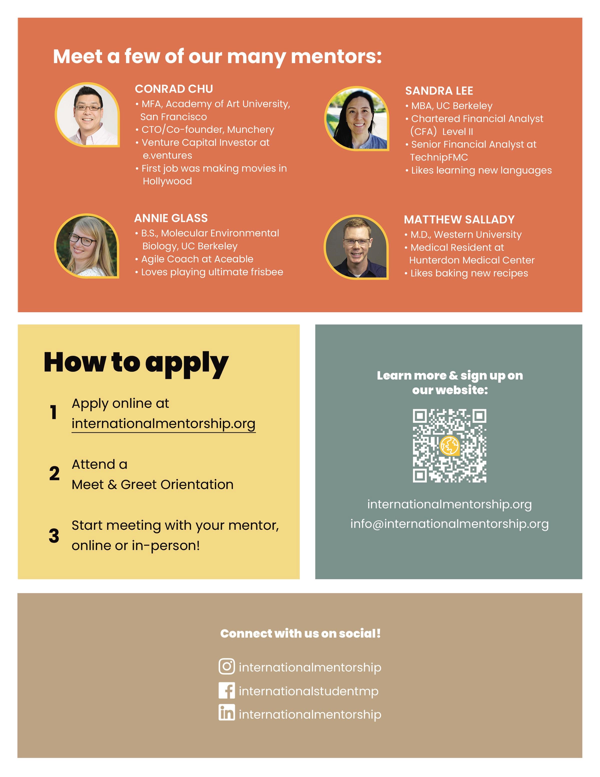
- Student recruitment pamphlet, designed hands-on
- Visual direction for the website and photography
- Canva brand kit and a nonprofit Canva account for local chapters
- Coaching a less experienced designer and teammates new to design
- Managing work across the organization, beyond brand
Worked with: Photographers, Designer, Web developer, Content creator, Founding team
The work
A brand others could use
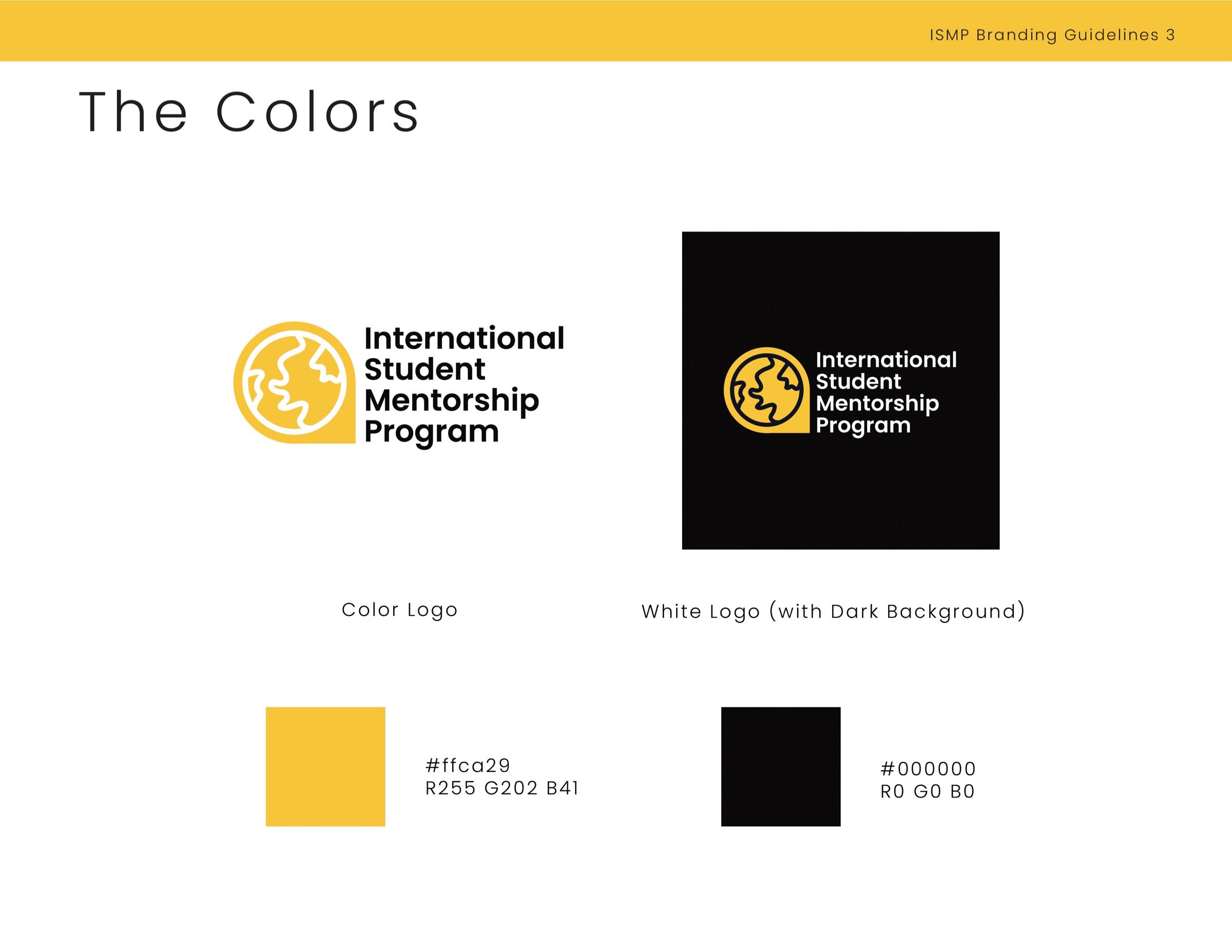
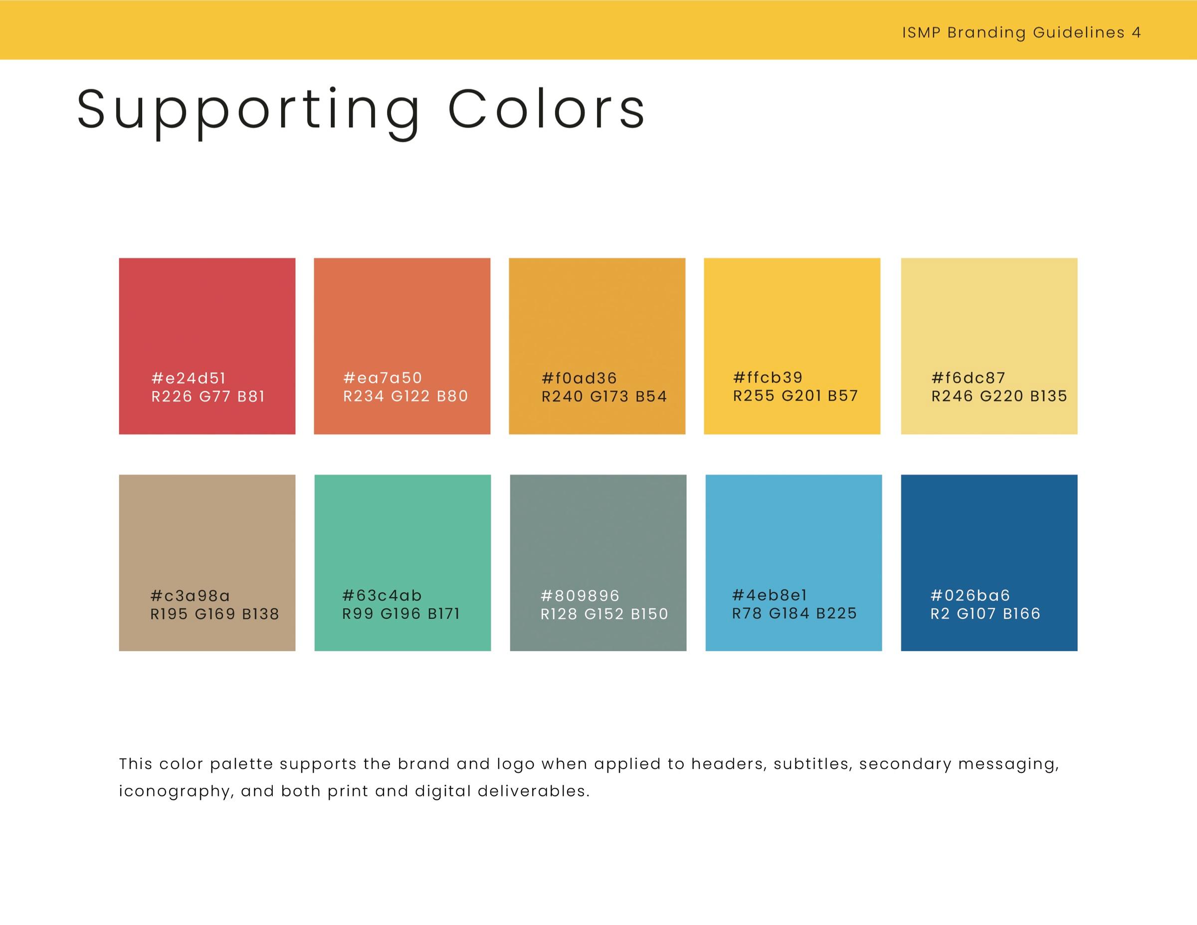
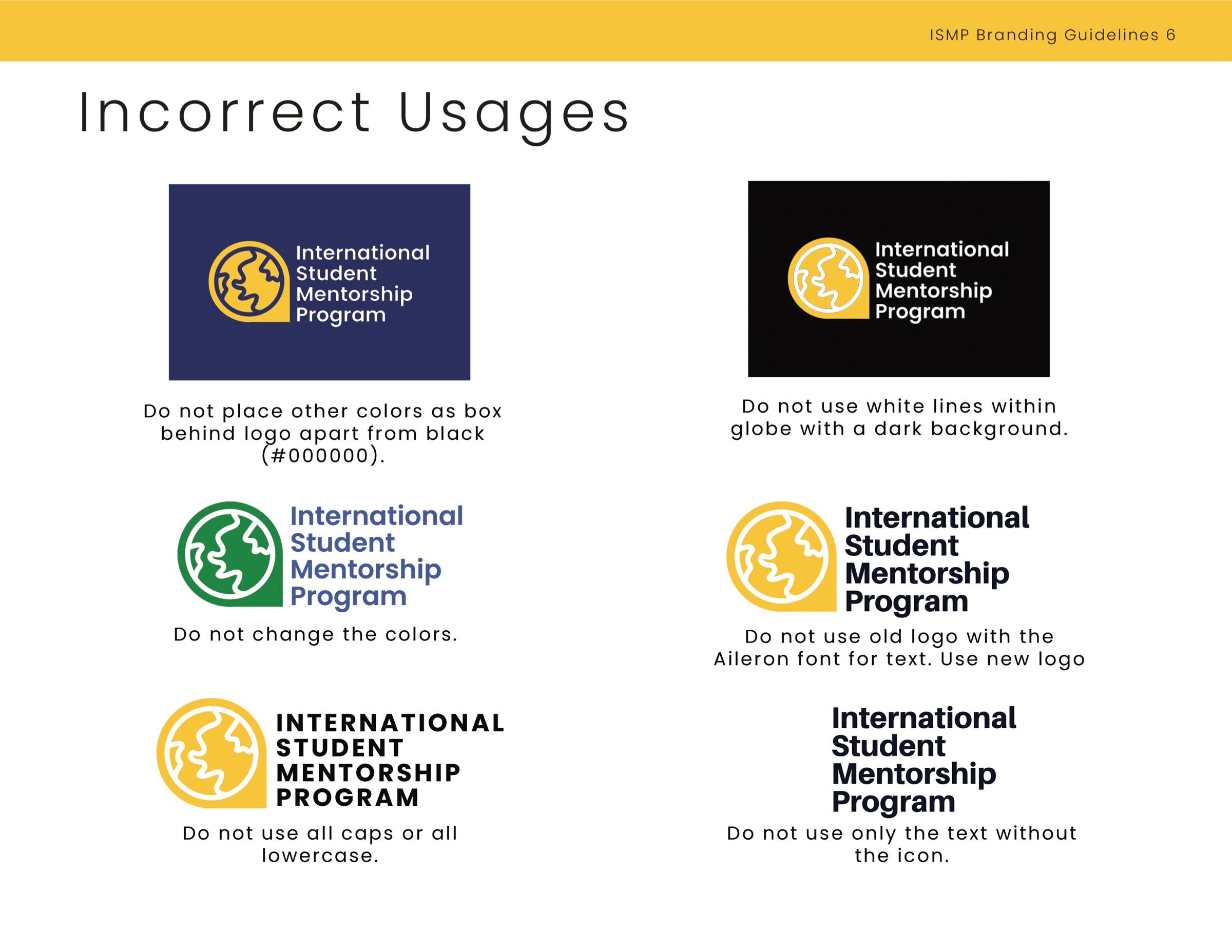
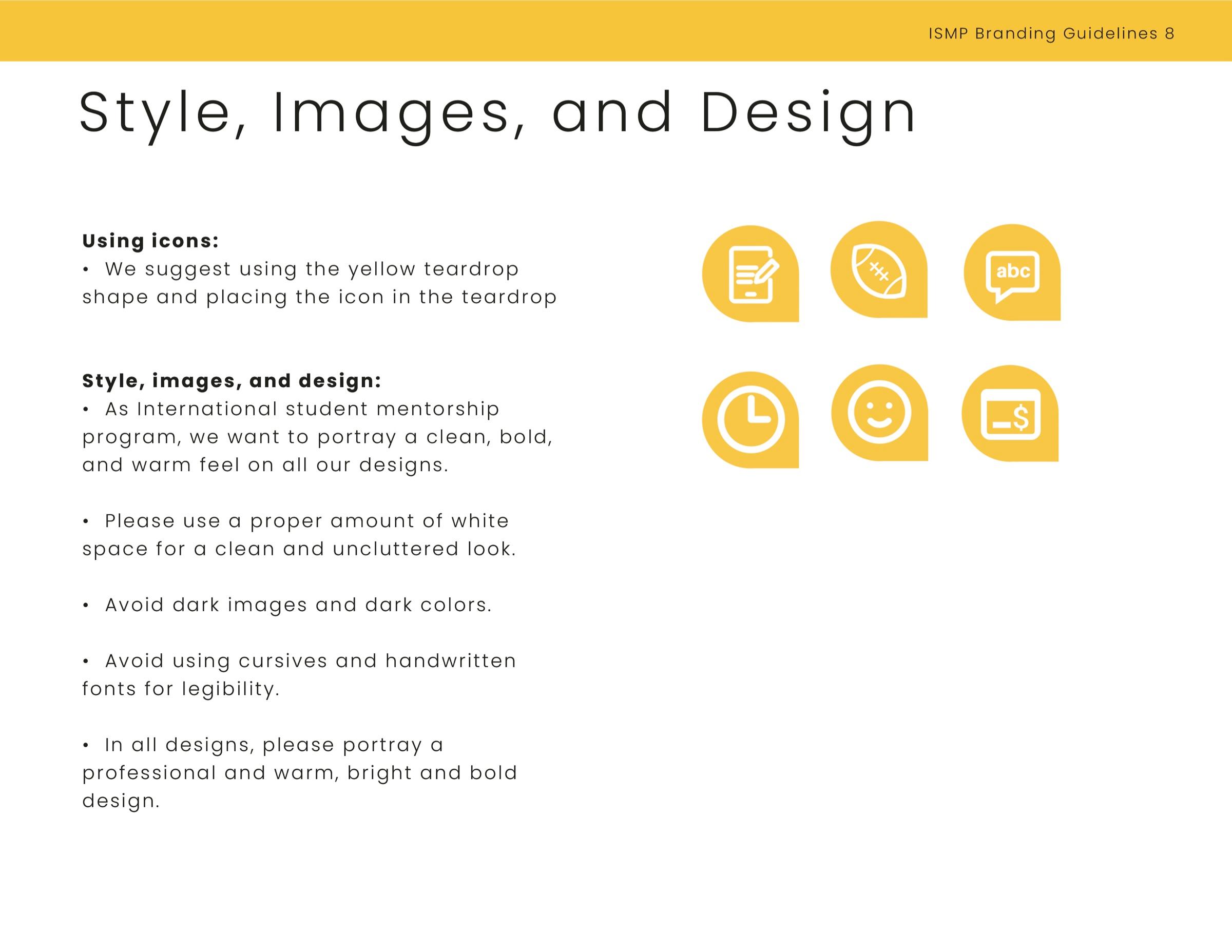
The guide was kept basic on purpose. Most local chapters don't have a designer, so it gives them the essentials (logo, colors, fonts, what not to do and simple rules for icons and images) and leaves room for each chapter to make the brand its own. I also built a Canva brand kit and set up a nonprofit Canva account, so every chapter has the same design elements at hand.
Impact
Six years later, the logo I designed is still the face of the program, and the brand has grown along with it.
Still in use
The original logo and identity from 2020 are still what the program uses today.
Built for chapters
With a simple guide and a shared Canva brand kit, local chapters without designers can make their own materials and stay on brand.
Growing reach
Since launch, the program has grown to more than 240 mentors across 40 campuses.