IntelliShift Rebrand
A complete brand modernization for a smaller, family-run B2B SaaS company competing against much larger organizations in fleet telematics tech. The goal was a cleaner, bolder and more confident identity that still felt approachable.
- Client
- IntelliShift
- Industry
- B2B SaaS · Fleet technology
- My role
- Creative Services Manager
- Scope
- Brand strategy, Logo & identity system, Color & typography, Brand guidelines, Brand applications
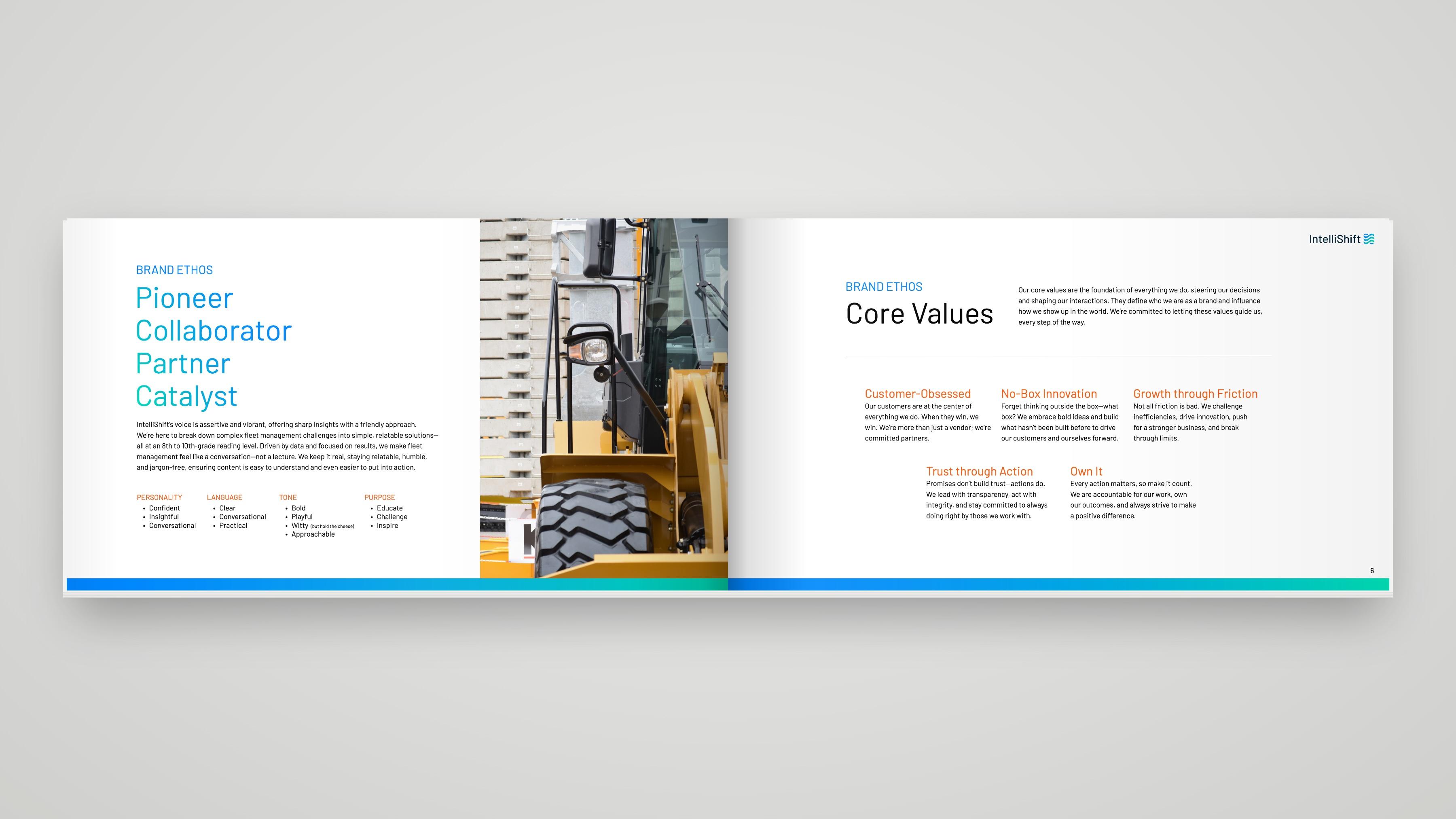
The challenge
IntelliShift is a family-run company competing with industry giants, and its old brand made it look out-dated.
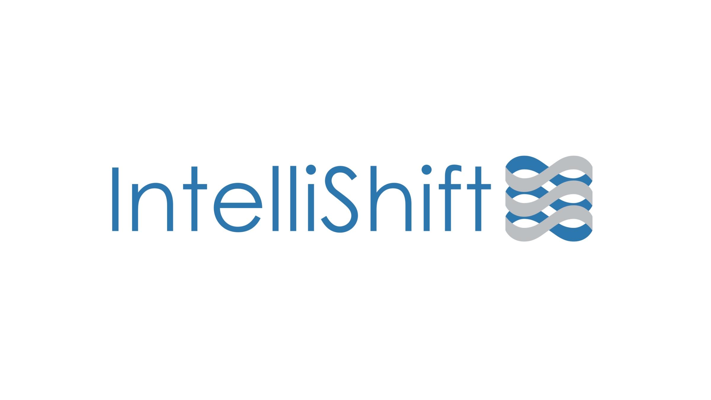
The brand I inherited was dark and dated, with heavy navy, a retro tech typeface and very little white space. The logo often became hard to read, as its infinity mark often washed out and felt heavy with it's thick band loops.
In an industry in which many of the brands used dark blues, the goal was to go brighter, cleaner and friendlier while keeping the infinity mark people loved.
Creative approach
Move IntelliShift from a dark, small-company tech look to something bright and forward looking that still feels friendly.
I compared competitors, studied modern B2B SaaS brands, and kept what was worth keeping from the old brand so customers would still recognize us.
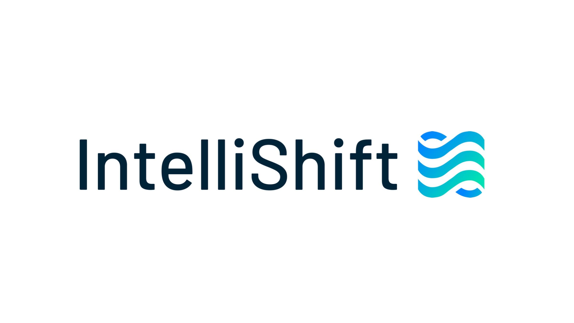
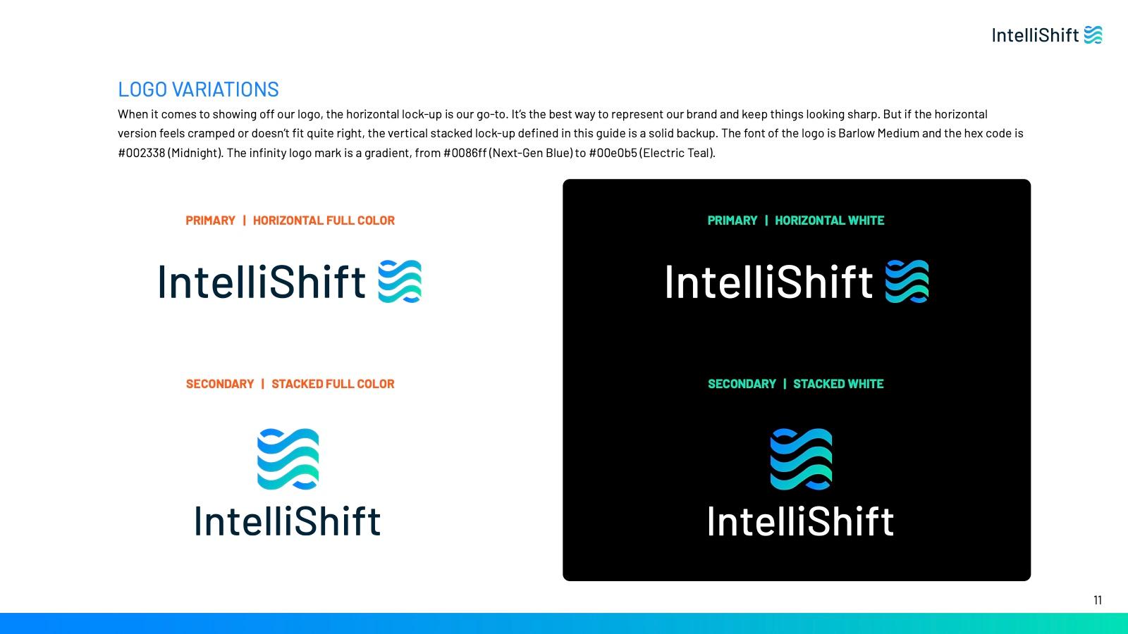
In the logo, I removed the infinity mark's back loops so each loop stays visible in one color and at small sizes, then added the blue to teal gradient. Orbitron was replaced by Barlow across the logo, headlines and body, and the palette moved to bright blue, teal and lots of white.
Brighter than the industry
Competitors lean on dark blues. Bright blue, teal and white make IntelliShift easy to pick out.
Readable at every size
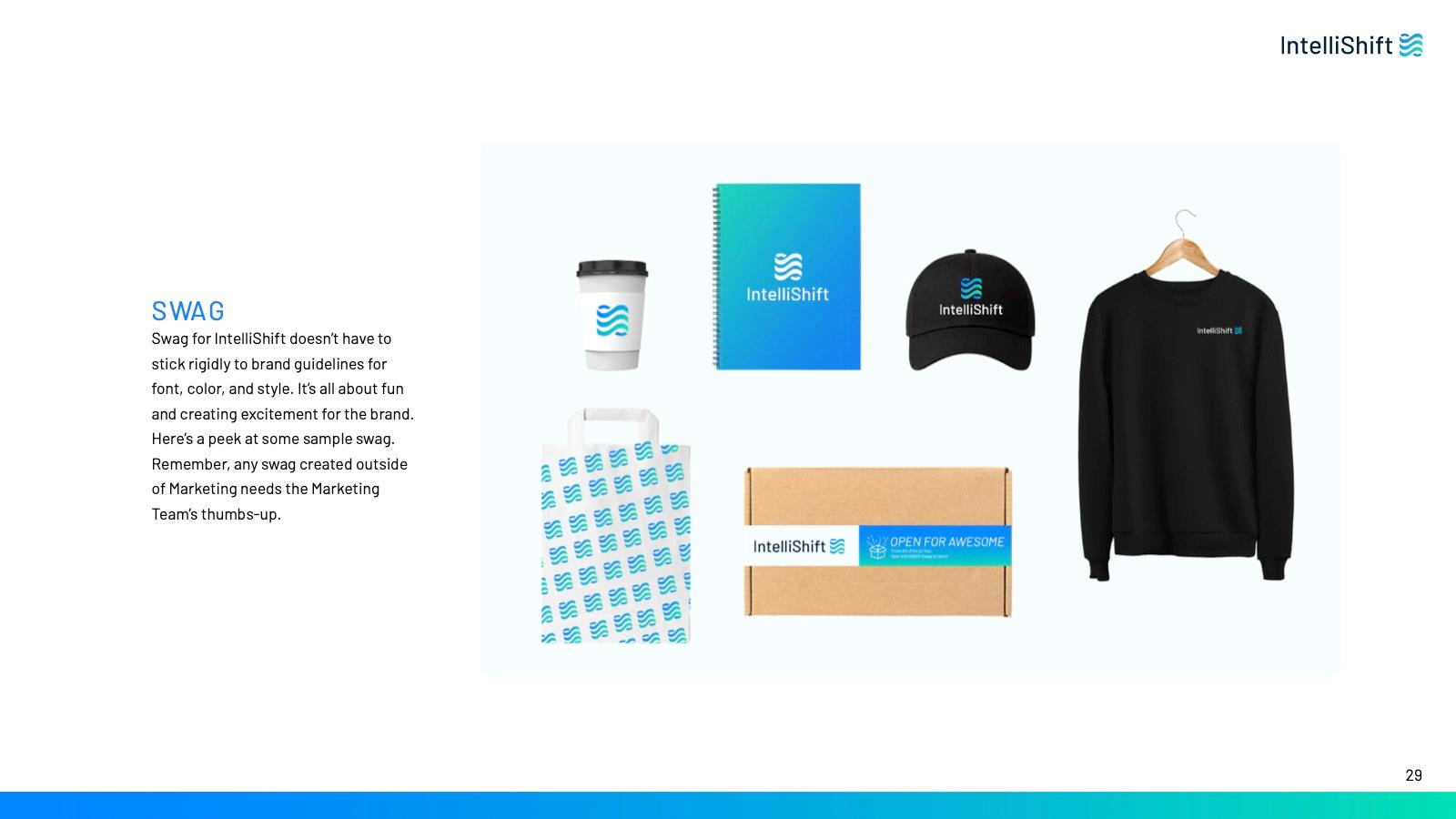
The logo and type had to hold up on a phone screen, a one-pager and an embroidered jacket.
Modern, but still friendly
A forward-looking look that keeps the friendliness of a family business.
My role
Every piece of the visual identity was my work, from the new logo to the brand book and the materials built on it.
- Competitive and B2B SaaS brand research
- Logo redesign and visual identity system
- Color, typography, photography and pattern direction
- Brand guidelines (the IntelliShift brand book)
- Sales decks, ebooks and trade show booths, redesigned hands-on
- Website redesign, in partnership with our website agency
Worked with: VP of Marketing (brand ethos, with the C-suite), Content strategist (brand voice and copy), Website agency
The work
Logo
Logo lockups
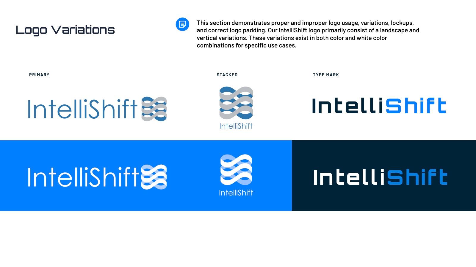
How the identity system works
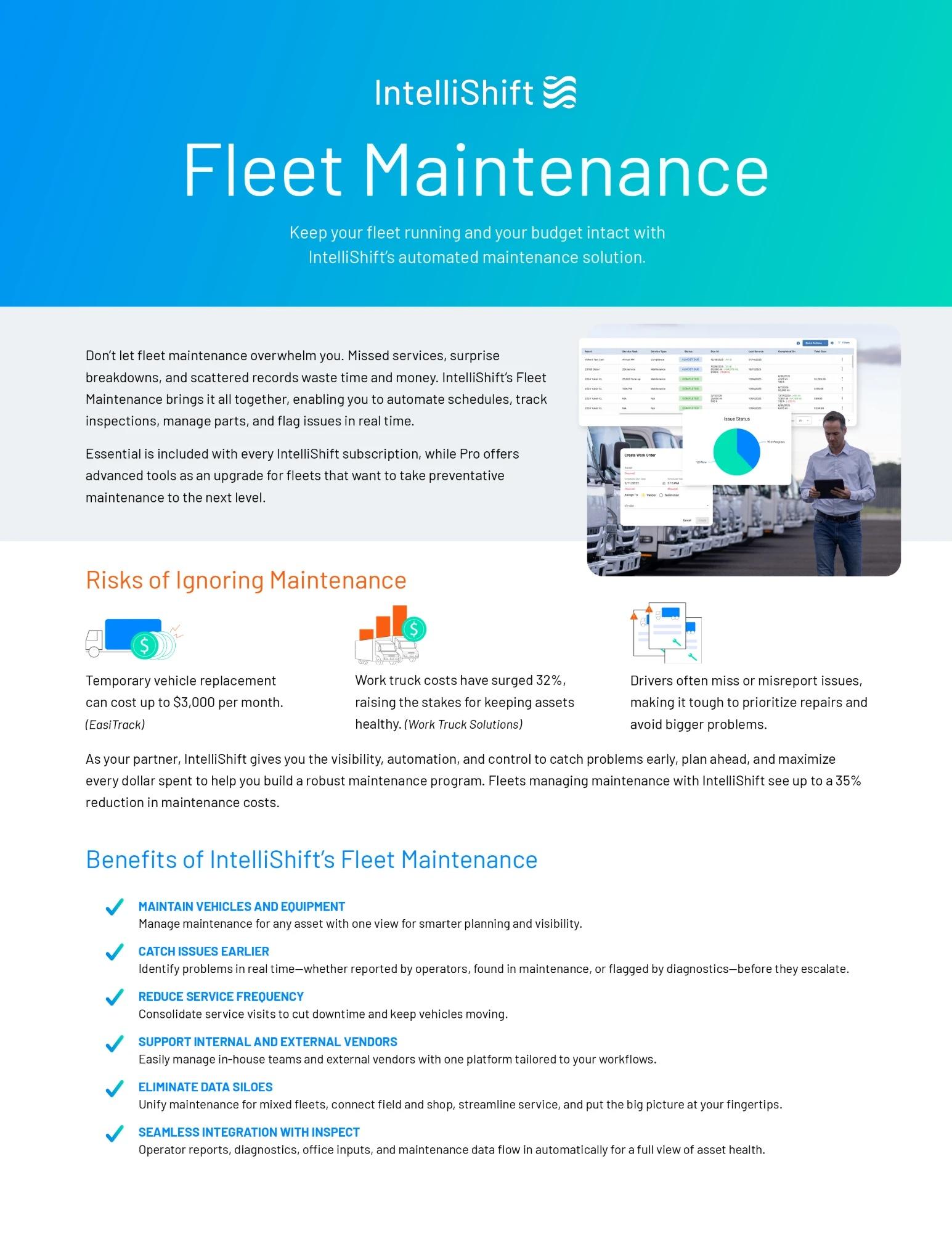
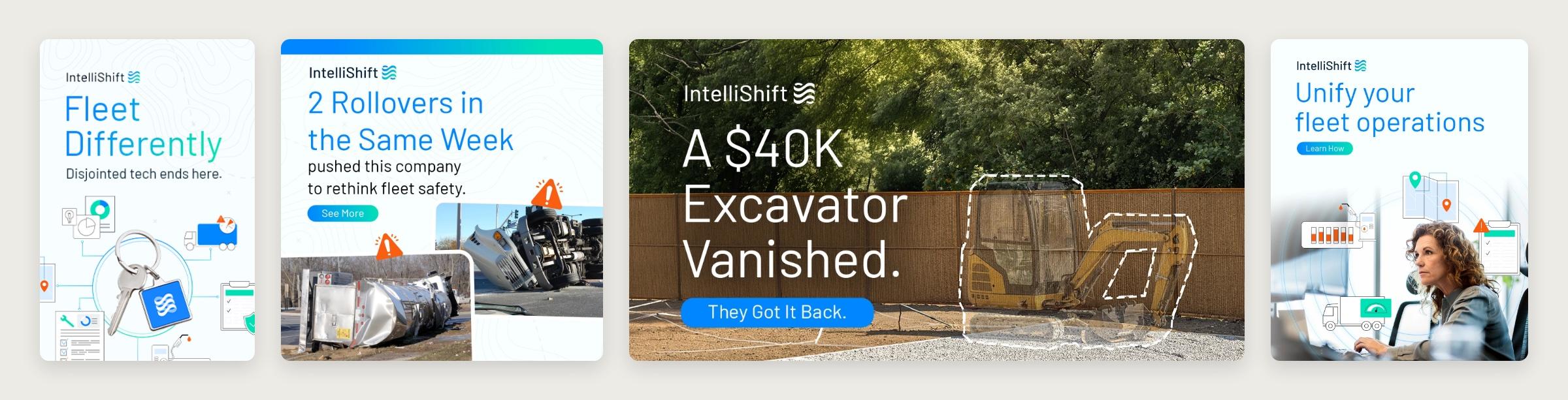
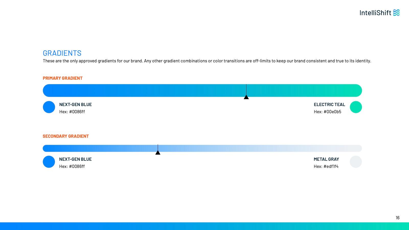
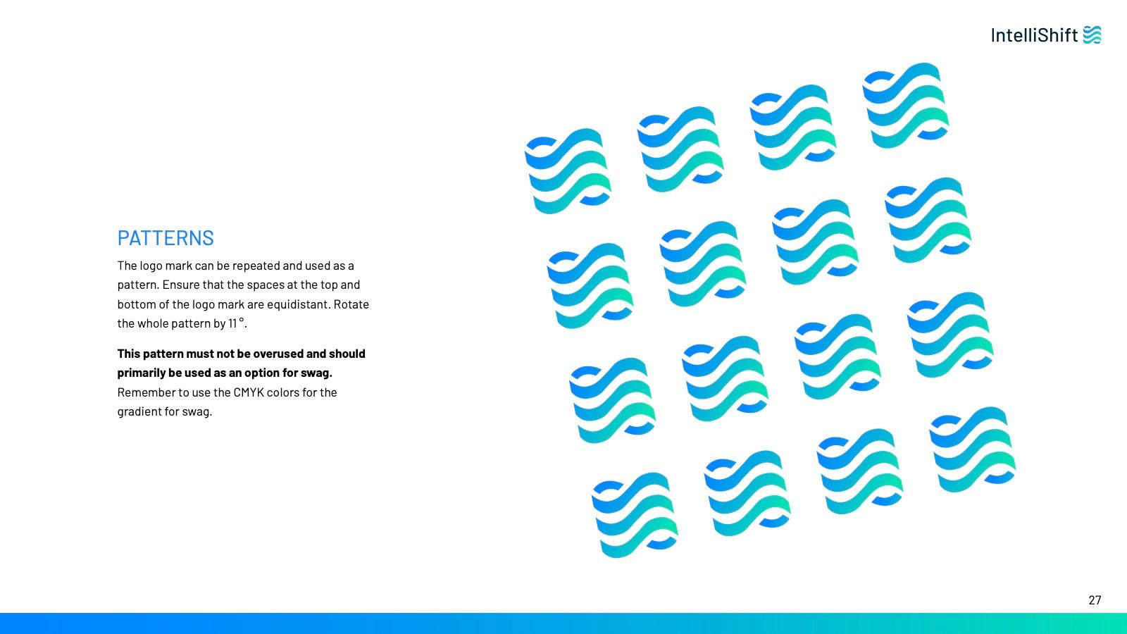
The logo was the start. The blue to teal gradient from the mark carries into headers, backgrounds and buttons, and the mark itself repeats as a pattern. Barlow handles every level of type, from the wordmark to body copy. Navy is still there, but only as an accent, so white space and bright color do most of the work.
One-pager

Digital ads


Impact
IntelliShift went from "never heard of you" to "Oh! IntelliShift, I've heard of you guys."
Recognized in the market
The name and the look became familiar. People who once told us they'd never heard of IntelliShift now recognize it.
Looks bigger than it is
We started to hear partners say IntelliShift looks like a much bigger company than it is. That was exactly the goal next to the industry giants.
Competitors took notice
Competitors started borrowing our design elements, like illustration styles and gradients they had never used before, and competing for our SEO keywords.